Plants and Pastures Co: a handmade skincare brand whose website finally looks like its products
I turned a stock “Welcome to our store” Shopify template into a branded, easy-to-browse store, with search-ready product pages, new collections and pages, and Google tools the owners hold themselves. It went live on November 3, 2026.

“…transformed it into a beautiful, professional site that feels exactly like us.”
Angelique and Jason, founders of Plants and Pastures Co
The client
Plants and Pastures Co makes small-batch skincare by hand on Long Island: grass-fed tallow balms, face creams, serums, clay masks, a Muscle + Joint Balm, magnesium spray, bug repellent and more. It's a two-person business. The founders, Angelique and Jason, bring a background in health and wellness coaching, physical therapy and herbal medicine to every formula.
They sell three ways: online through Shopify, at farmers markets and craft fairs across Long Island, and through local shops that carry their products.
Goals
- Look like the brand. Their logo, their colors, their photos and their words, from the first screen to the footer.
- Make it easy to shop. Help every visitor find face care, balms, bundles or body care in one or two taps, especially on a phone.
- Put the label facts on the site. Ingredients, directions, sizes and warnings on every product, in the founders' own wording.
- Connect the website to the markets. Show where to find them this week, and which shops carry their products.
- Get found. Give Google clear titles, descriptions and structure for every page, product and collection, and set up the free Google tools in the owners' names.
- Make them independent. Hand over a site they can update themselves, plus a simple plan for growing their email list.
The problem
The products were great. The website didn't show it.
When the founders first got in touch, they said they couldn't get the most out of Shopify. They weren't sure how to add pages, couldn't get the look they wanted, and wanted a running photo banner. They also asked about SEO, marketing and reaching more people.
I started with a free website review. Here's what the old site looked like:
- A generic first screen. A "Welcome to our store" bar, the store name in plain text instead of their logo, and a stock-style photo of a face with no product in it.
- A confusing menu. Home, Catalog, About Us, Radiant Skin Gallery, Contact and "Why should I use Tallow on my Skin?" There were no collections, so shoppers couldn't browse by what they needed.
- Thin product pages. A short description and not much else. The ingredients, directions and warnings printed on their own labels weren't on the site.
- An empty Events page. A "Where to Find Us" heading with nothing under it, even though markets are one of the main ways they sell.
- An About page that was plain text. The story was there, but nothing about it said "meet the people who make this."
- Weak SEO basics. Missing descriptions and collections, no structured data, and a link preview that showed a cropped old logo.
My recommendation in that review was to fix one thing first: the homepage first screen. After a call, they asked me to take on the whole site.
What I did
Strategy
I began with their own words and materials: the intake form, a setup call, a folder of their product photos, their print labels and a finishing-touches form. Product facts came straight from the labels. Every product photo is theirs, cropped and color-corrected but never redrawn. The category icons come from a graphic the founders made themselves.
Everything was built on a copy of their theme, with backups. The live store didn't change until they gave the go-ahead to launch.
Design
The homepage opening section. Instead of one big photo, the first screen now shows the whole range:
- their logo and tagline, "Natural Solutions for Everyday Life," in the header
- a clear headline: "Skincare from the pasture and the garden"
- two buttons, Shop all and Meet the makers
- all seven product categories, with icons drawn from their own graphic
- a trust strip right underneath: 100% grass-fed and finished tallow · No chemicals or fillers · Handcrafted in small batches
People come to Plants and Pastures for different things, like face care, sore muscles or a gift. Now every visitor can tap straight to what they came for. The opening section never needs a new photo to stay current, and it works well on phones.

A simpler menu. Six clear choices (Shop, Learn, Events, Where to Buy, About, Contact), with drop-downs under Shop, Learn and About and a matching three-column footer (Shop, Learn, Visit). "Catalog" and "Radiant Skin Gallery" are gone.
The rotating photo banner. The running photo banner they asked for in their very first message. It's built into the theme with no extra app, and it runs above the footer on every page.
Reviews. Their Judge.me reviews are restyled to match the brand. The homepage features one customer quote as real text, with the star average and a link to every review.
Build
Category structure and collections. Shoppers can now browse by need. There are new collections for Face, Tallow Balms, Bundles, Body and Wellness, and Customer Favorites, and the Shop all page lists best sellers first.
Product pages. Their photos come first, with clear sections for How to use, Size and Warnings, copied word for word from their labels. Health wording matches the labels, with no new claims. Muscle + Joint Balm got a fully rewritten description.
SEO on every product, page and collection. All 19 products, every collection and every page have their own search title and description, along with image alt text and structured data. A new link-preview image means shared links show the brand instead of a cropped old logo.
The About page. "Meet the Makers": the founders' own photos, shorter bios and the mission in one line, written so it sounds like them.
The Events page. The founders add market dates themselves in Shopify. The page sorts them by date, hides dates that have passed, handles repeat markets, and gives every date Directions and Add to calendar buttons. The homepage shows the next markets on its own.
Where to Buy. A page listing every local shop that carries their products, with what each shop carries, a map, directions and a link to each shop's website.
FAQ, and How to Use and Ingredients. Straight answers grouped into four topics (about tallow, using the products, orders and shipping, and finding them), plus a guide to which product goes where in a daily routine.
Google Search Console and Google Analytics. I set up both, verified the site and submitted the sitemap. The owners are added to both accounts at the top level (Owner in Search Console, Admin in Analytics), so the data belongs to them, not to me.
Google Business Profile. I set up the profile and filled it out with their categories, hours, social links, logo, cover photo and their own photos. Verification is the next step.
Marketing and handover
A marketing strategy PDF. A short, practical plan written for their business: what to send their email list and how often, how to grow the list at markets and online, and how to turn market regulars into repeat online customers.
Discount codes, popup and automations. Four automated emails are written and built (Welcome, Thank you, Something new and Win back). So are four discount codes and a newsletter signup popup. All of it is set up and ready to switch on once the founders approve it.
The handover video and Self-Help Guide. A narrated how-to video with 13 chapters and subtitles, plus a written guide built around their own store. Together they show how to add events, swap photos, edit products and make design changes safely, without calling anyone.
A brand style sheet. One page with their logo, colors and type, to hand to anyone who designs for them.

The process
- Free website review. I reviewed the site and named the one change that would matter most.
- Call and scope. We talked it through, and they chose the full rebuild.
- Setup call and intake. I gathered their goals, photos, label PDFs, logo files and social links.
- Build on a safe copy. I built the new design on a duplicate of their theme, with backups, so the live store stayed the same.
- Review rounds. They reviewed full previews and sent corrections in their own words: the tagline, "No chemicals or fillers," writing out "and" instead of the ampersand, the photo banner on every page, and dropping the old gallery.
- Marketing plan and Google setup. I delivered the strategy PDF and set up the Google Business Profile.
- Final approval. They approved the final preview and gave the go-ahead to launch.
- Launch and live check. I published the new design, then checked the live site page by page on desktop and phone.
- Google tools. I verified Search Console, submitted the sitemap, set up Analytics and gave them top-level access to both.
- Handover. I delivered the how-to video, the Self-Help Guide and a clear "what's next" list.
- Polish. I fine-tuned the live site until the homepage scored a perfect 100 on Google's Lighthouse SEO and accessibility checks.
Before and after


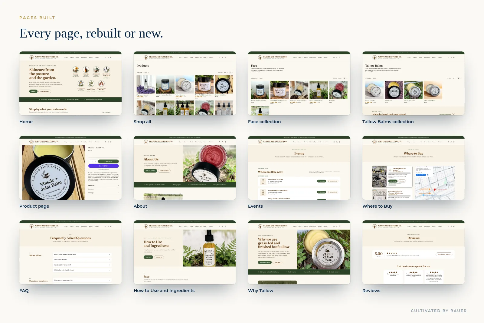
Every page, rebuilt
Made for phones

Results
What's true and checkable today:
- Live since November 3, 2026 at plantsandpasturesco.com, on the founders' existing Shopify store.
- 19 products, every collection and every page have their own search title and description.
- Five new collections are live: Face, Tallow Balms, Bundles, Body and Wellness, and Customer Favorites.
- New and rebuilt pages are live: About, Events, Where to Buy, FAQ, How to Use and Ingredients, Why Tallow, Reviews and Contact.
- Search Console is verified and the sitemap is submitted. Google Analytics is set up and connected. The owners have top-level access to both.
- The launch check passed: 26 live page loads, no broken images and no script errors.
- Perfect 100 on Google's Lighthouse SEO and accessibility checks after a round of fine-tuning: homepage accessibility 100 and SEO 100, product page SEO 100.
- The founders can run it themselves, with a how-to video, a written guide and a self-updating Events page.
- Marketing is ready to switch on: four automated emails, four discount codes and a signup popup, waiting for their approval.
In their words
We’re so happy with the website Mike created for Plants & Pastures Co.! He took our basic website and all the information we shared and transformed it into a beautiful, professional site that feels exactly like us. He understood our vision and what we wanted our company to represent, and brought it all together with thoughtful suggestions and a great eye for design.
Mike was professional, organized, and quick throughout the entire process. He made everything easy and delivered exactly what we wanted. We’re proud to share our new website and would absolutely recommend him!
Want this for your business?
Plants and Pastures started with one free, focused piece of help: a review of their website and the one change that would matter most.
What would make your business easier to run? Tell me the one thing that's in your way. If it's a single focused task, Free Help covers it. If it's bigger, you'll know the price before I start.